Probably the one thing that everyone knows about Arabic is that it’s fiendishly difficult, due to the grammatical complexity, the bizarre noises that masquerade as phonemes, and the incomprehensible squiggly script. The last of these is actually not a great problem – there are only 28 basic letters to learn, and like Roman letters, many have elements in common with one another. And once you do know them, you open up a world of practical and aesthetic value.
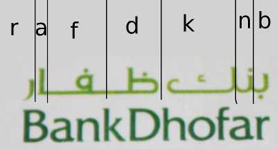
To illustrate the latter, here’s an example from the logo of an Omani bank:
 Arabic of course reads from right to left, and omits short vowels; the lines added show the breaks between the different letters, and the (rough) Roman equivalents above indicate the sound.
One of the most striking features is the cursivity, if that’s a word: although this is written in a very arial-like font (to show how modern they are), most of the letters in each word are still connected. Also, the letters are highly variable in length (compare the three letters of ‘bank’). The length of each letter is not fixed: it can be lengthened or shortened as the writer wishes for aesthetic effect. One other feature of Arabic script is that letters usually have different forms in the final as opposed to first or middle positions in the word, generally with the addition of a flourish (which is fun to write!). Here the kick of the k is emphasised by the diminished first two letters.
Similarly, the line used to connect letters (here seen either side of the f) can be varied in length as desired; the relatively long lines used here make the Dhofar long enough to balance the Bank. Finally, and at the risk of reading too much into it, the close verticals of the b and n on one side and of the a and r on the other also seem designed to balance one another.
Of course this is a bank logo rather than calligraphy, and people here would probably think I was mad for rhapsodising over the aesthetic appeal on display here (like the Chinese people who are bemused by westerners’ taste for tattoos in their script). Conversely designers of logos in Roman script put a great deal of thought into their own work; perhaps an Arabic speaker would see similar wonders there. But I think the flexibility of design noted here is something particular to the Arabic script, and something which allows relatively greater care for aesthetic effect. There’s a lovely tissue box which I have my eye on, and may come back to later.

I think this lettering is very beautiful too. Graceful.